


By Guest post- Meranda Devan, Swedish furniture blog July 17th, 2013

Swedish winters are long, dark and dreary, so historically Swedes have always turned to lighter interiors. Swedish style isn’t all about the gray and the white interiors they are famous for, but many homes feature brighter, richer colors to decorate around.
There are so many shades and tones of paint, that it can be impossible to decide on one color. Buy sample-size colors to help you make the perfect selection. A color can look quite different at night than the day. We recently painted the outside of our home, and the color which looked to be a creamy yellow at night, turned green in the day. Be sure to try your selected colors on a few different walls to determine what suits which room. You’ll thank yourself for making this extra effort before spending $$$ on the wrong shade.
Don’t judge the room until the paint is in place, and accessories and furniture are placed. A color which may seem to bright can be toned down by wall accessories, coordinating drapes, and art work. Consider working with the off shades of the primary colors. Intead of purple, consider lilac, or a raspberry tint.
Consider whether you are a warm or cool person. I once was asked this by a hairdresser, looking to choose a shade of blonde. I never gave it much thought before, but knowing which color you lean towards can certainly make picking colors a lot easier. Earthy reds, dusty warm plums, and rusty golds are in the warm color range. Silver blues, mint, and lavenders are colors which are cooler.
Advice From Pros
“Design is not just what it looks like and feels like. Design is how it works” Steve Jobs
“Green pigment was expensive in the 18th century, making it a status symbol. So it would have been appropriate for the royal governor’s house. I’ve been a curator at Colonial Williamsburg for 20 years, and when my husband and I lived in a historic house, we had similar green woodwork. It worked with every fabric I wanted to use, and it’s a great mood enhancer—chlorophyll for the spirit!” —Liza Gusler
“People think that they need to use small furniture and light colors to make a small room look big, but that’s not the case at all. Dark colors and just a few pieces of large-scale furniture, with the appropriate lighting and accessories, can give a room a larger, more luxurious feel.” —Mona Hajj
“Everything else in my house is off-white and grey, and I just had to have a break from that. I was looking at my pond, which is this murky shade of acid green, and I thought, ‘I’ll do that in high gloss to make it even more watery and translucent.’ It’s strange, but I love it.” —Stephen Sills
“Luxury must be comfortable, otherwise it is not luxury.” – Coco Chanel
“While looking at one of my first New York apartments, David Hicks told me diplomatically,’Dear boy, if you’re going to paint the walls white, you need art.'” Peter Dunham
“The only time white curtain lining should be used is with white curtains- J Randall Powers
“Use the precious for everyday purposes. We’ll rummage through clients closets and find loads of precious hand-me-downs like porcelain vases and crystal that are a bit out of vogue. We’ll use them for completely ordinary purposes – a case becomes a chic pencil holder, a crystal bowl holds makeup brushes. Turn the ordinary into a special moment” Benjamin Dhong
“I learned that passion about objects and furnishings makes for fearless decorators—and that if you are comfortable in your home, everyone else will be too. That sense of authenticity is what gives a home its soul.”- Courtnay Daniels Haden
“The most elegant interiors are just slightly tatty.” – David Netto
“Playing it safe. Instead, put a large-scale printed fabric or wallpaper on the walls and even the ceiling. It’s easier, safer, and less expensive to be dramatic in a small space. You might get tired of a bold print in the main living area, but it can make a smaller, less-used room an exciting space to spend time.” —Victoria Neale
“Use wallpaper in unexpected places” on the ceiling, in a paneled room, in closets, hallways and small foyers. A great pattern or texture in small spaces can be a prodigious twist! Lindsey Coral Harper
“I like to “A home should be a distillation of your interests, of who you really are. If you’re happy with your life, your space will reflect that.” – Rafael de Cárdenas
“Our kitchen is warm; it’s who we are. And it has everything. Honestly, I could get rid of the rest of the house and just live in the kitchen.”—Ralph Lauren Home executive Adrian Kahan
“Most people start out wanting to go for their fantasy, but end up painting their walls dove-white.” -Rayman Boozer
“When it comes to art, buy with your eyes, not your ears. I tried very hard not to ‘decorate’ with art. Art should be reflective of your personality and what’s going on in your head—not reflective of the colors of a sofa.” Hotelier Jason Pomeranc
“Cramming the space with too much stuff. A large piece of furniture can actually make the space feel larger, as long as it’s selected carefully. For instance, if you have the benefit of high ceilings, a tall cabinet appropriately placed has the effect of drawing one’s eye upward and away from the small footprint of the room. Just make sure every piece counts and holds its place and lets your eye rest.” —Laura Kirr
“Taupe — that duplicitous stony gray-brown. Taupe can either go green or pink, but if you have a green taupe next to a pink taupe, the room ends up looking like some powdery, tragic form of Christmas. Taupe is a really good color to use in main rooms because it’s companionable — you can always carefully introduce a beautiful blue or a great green or brown. But taupe’s a politician — sociable yet slippery. And there are no near misses. You either nail it, or you blow it completely.” —Susan Ferrier
” The essence of interior design will always be about people and how they live. It is about the realities of what makes for an attractive, civilized meaningful environment, not about fashion or what’s in or waht’s out. This is not an easy job.” -Albert Hadley
“Not paying enough attention to the color of flooring and walls. Lighter walls and lighter floors do automatically give the illusion of more space.” —Mary McGee
“Design is a plan for arranging elements in such a way as best to accomplish a particular purpose.” – Charles Eames
“I try not to bring in anything I don’t love looking at. It’s about restaint … There is something about an unfinished quality that leaves within you that sense of possibility.” —Artist Caio Fonseca
“Buy the best, and you only cry once.” – Miles Redd
“There is a conception in this country about luxurious things that we have to save them for a time that’s right. But an object is truly luxurious if you allow it to be, if you use it. When you live with beautiful things you stimulate your mind, you enjoy life a little bit more.” Ralph Rucci
“When I see something great, it doesn’t matter where it comes from. In fact, sometimes the best things are from cheesy places.” -Hotelier/restaurateur Jeff Klein
“Have nothing in your houses which you do not know to be useful or believe to be beautiful ” William Morris
“Simplicity is the ultimate form of sophistication.” – Leonardo da Vinci
“Less is more. Texture is essential as well as scale” Trip Haenish
“Always have good reading lights in every room and put everything on a dimmer” Shawn Henderson
“…a house is much more than a mere shelter, it should lift us emotionally and spiritually.” – John Saladino
“The details are not the details, they make the design.” – Charles Eames
“I need contrast—the old and the new, the rough and the soft. The clash of it all is very sexy.”—Fashion designer Catherine Malandrino
“I’m all about exuberance. We only have one short life to live, and we shouldn’t waste it being tasteful.” – Isaac Mizrahi
“The color combination of blue and brown is classic, but let’s move on from the ’90s, people! “Chrome” is getting overused as well, to the point where it’s starting to look cheap. I recommend a variety of finishes in gold, brushed, shiny, aged and mirrored! Delicious. Finally, another trend that that I’m tired of seeing is the overuse of the ikat pattern. I feel this pattern should be modified in a unique way. It’s everywhere but I’m not seeing anything special come down the line.” David Bromstad
“When you’re building a room, you’re building character, and character is the strength and wisdom of a home” – Rose Tarlow
“So many people arrange furniture in order to see what’s going on outside. But why? The view isn’t going anywhere.”—Interior designer Albert Hadley
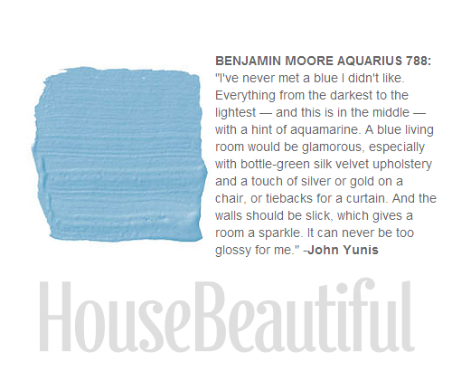
“Blue is my secret agent color. I’m always sneaking it in these days. I guess it’s like a bit of sky peeking out, which makes everything work. Blue is lightness and air. I used to use white to lighten things up, but now I’m using blue. It gives breath to everything.” William Diamond- Uses Sherwin Williams Sassy Blue 1241
“Life in the 21st century means taking the best of history and making it work for you” Miles Redd
“Kitchens should be designed around what’s truly important—fun, food, and life.”—Chef/restaurateur Daniel Boulud
“Good design has to tell a story. It has to stop people, and it has to make them wonder. Good design is a conversation.” – Zahid Sardan
“The design process is hard work, but in the end I want my interiors to look inspired and relaxed, not studied.” -Katie Ridder
“You really have to think before doing anything to an old house. Because you can never get it back to the way it was.”—Anthropologie antiques buyer Keith Johnson
“Light is the magical ingredient that makes or breaks a space; it’s one of the most important elements in all my interiors.”—Interior designer Benjamin Noriega-Ortiz
“Blue. It’s such a gigantic color — it covers the ocean, the sky, and everything in between. When you’re trying to get a blue right, you’re always working with whatever blue light is coming in the window and you have to add that factor to the paint chip, or else you’ll wind up with year-round Easter. Always go one or two steps lighter than you think. The color most people think of as blue is really a warm gray, but it reads as blue. It took me years to realize this! There’s a lovely Benjamin Moore color called Stonington Gray that’s a much more confident blue than people might imagine. Or if you’re a blonde, Ralph Lauren makes one called Basalt — it’s the palest, clearest blue, as if you walked outside in the early spring and captured the color behind the forsythia.” —Mallory Marshall
“Yellow is a color that’s easier to use as a textile than a paint.” -Steven Gambrel
“When you do a modern space, each item is extremely important. You can’t ad lib.” – Noel Jeffrey
“I don’t discriminate when it comes to provenance. Home Depot changed my life.” -Tricia Foley
“There is one fundamental fact about lighting: Where there is no light, there is no beauty.” – Billy Baldwin
“Measuring and laying out the room in advance can save you a lot headaches” David Bromstad
“The client is not always right.” – Enzo Ferrari
“One of the greatest things about working for yourself is that you can work without interference. I firmly believe that the initial instinct is the best in design, and when you make changes to accommodate a client,you may be weakening the concept.” – Robert Kime
The hardest colors get right- “Terra-cotta. You see it in nature and in bricks, but getting it in paint is nearly impossible. It looks too flat or too orange. You never capture the depth and warmth properly. The only way I know to get the right color is go to Roussillon, France. It’s an amazing little medieval village in Languedoc, and the entire town is painted with this natural pigment that they mine out of the ground. They use it as a wash on stone, where it seeps in, and the colors range from this really rich yellow to this vibrant terra-cotta and every shade in between. It’s a vision. You can buy the dry pigment and throw it into a paint recipe.” —Annie Selke
“Beautifully designed objects fulfill our desire for art and poetry.” – Cindy Coleman
“Even if I love it, I don’t put everything on display. I am always ruthlessly editing.”—Madeline Weinrib
“I don’t think of decorating as a science or a discipline. People always say start with the rug, but it is often the last thing I end up selecting. I begin with whatever makes my heart sing.”- Deborah Buck
“During college, when I was working full time for my father [the decorator Mark Hampton], I rented an apartment and I just couldn’t take time off to paint it. So I went there one evening and stayed up all night painting the place what I thought was a lovely pale yellow. When the sun came up, I realized I’d painted the walls the color of insanity. I had to immediately mix in all my trim color to tone it down. Yellow is an electric color and wholly misleading. It becomes more yellow with the sun’s yellow light on it. The moral is, even if you think your yellow is the one, go paler.” —Alexa Hampton
“You may concentrate on appearances all through the rest of your house,but in the bedroom comfort should be supreme. I think that bedrooms should also be very intimate rooms-they should express your personal preferences in every way…Of all the rooms in the house your bedroom isyours.” – Dorothy Draper
“The color I find most beautiful and chic is gray. But it’s very hard to procure that perfect, soft, luminescent, silvery gray shade you see in gunmetal, silver, zinc, or pewter. To try to get that color in a surface that’s nonreflective and doesn’t have a three-dimensional quality is the challenge. I often try a dozen samples just to find one gray. But if it’s simplicity you crave, there’s a divine gray that almost always works: Benjamin Moore’s Horizon. If a friend calls me and says, ‘Help! What do I do?’ I reply, ‘Paint the walls Horizon and the trim white.’ Think of a gray suit with a white shirt. It’s a nice clean story, and you can go in a hundred different directions with the tie.” —Steven Gambrel
“Modesty is great, and quietness is nice, but sometimes it’s much more fun to be decadent.”- Robin Standefer
“It’s not hard to make a space that looks good by itself. The trick is to craft a room that’s even more attractive when it’s occupied. That’s when it becomes magical.” -Kerry Joyce
“[My approach] is all about the wow factor, and sometimes that means pushing right to the edge of good taste. But if you don’t push, life’s pretty dull”—Furniture dealer Todd Merrill

Martha Angus


Marianne von Kantzow
James Duncan Canape Louis XV Sofa

My Picks From The Pratt & Lambert Red, Blush and Pink Collection

Danish, Swedish, Gustavian Antiques From Scandinavian Antiques
The lovely distressed paint on this corner cupboard is all original. The
exterior is a pale pink and the interior white. The gentle carving of
the gothic gallery top add to its country appeal. Please note the close
up photo of the base reveals that one side is longer than the other
which is the original design.

Interior Designer Steven Gambrels Home In Sag Harbor
Period Gustavian two over two chest of drawers in red paint. Egg and
dart molding at the top, with fluting and carved rosettes on the
chamfered sides. The locks have been replaced at sometime in the past.
The Cheery Swedish Summer time Cottage by LASC Studio featured in Dwell Magazine is a fresh and exciting modern day dream home embracing modest Scandinavian layout. Located in Skåne, Sweden, this converted farmhouse is a melodious mix of pine wood, concrete and simple white plaster with surprising components of vibrant shade. Splashes of colour are seen throughout the house.
A painted Scandinavian Seat with Blanket chest under seat. Old paint

Scandinavian bench with original blue over green paint.

Blue Painted Swedish Sofa– housemartin.typepad.com

Lovely upholstered Swedish Sofa scraped down to original blue color.

My Picks From The Pratt & Lambert Blue Color Collection
Original Blue Painted Swedish Corner Cupboard From Scandinavian Antiques

The turquoise on the walls (Parker Paint’s Waterside; see next slide)
looks even richer next to woodwork painted Benjamin Moore’s Ivory White
925 in this dining room by Markham Roberts – Seen On Home Beautiful
Summer Country House In Sweden – Unknown Details
Summer Country House In Sweden – Unknown Details
Ina Martinez - Awesome .. !!